Quokka Sports Daze
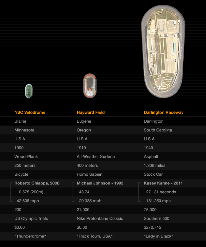
This is an oval racing comparsion infographic I’ve been working on for the last couple of weekends. It takes me back to my days at Quokka Sports. Between 1997-2001, I worked (and lived) at Quokka Sports, and visualizations like this information graphic were daily exercises. Of course, at Quokka this visualization would have been interactive (Flash/video) with exceptional writing.
Quokka Sports was an adrenaline-inducing company. I honed my design chops while a designer there. At the “Q” there was amazing talent (designers, writers, producers) and the people that worked there were passionate about sports. The hours were grueling, but I’m forever grateful for having worked at the Quokka Sports. It was a design education and a half.
 Maps
Maps
Ended up going with Bing maps, because it was easier to find race tracks than Google maps. (It’s a frustrating experience to find landmarks with Google maps. Burned-up way too many hours). I struggled with whether to trace these satellite maps into vectors. In the end, the granularity of the satellite images worked better in this case. They remind me of of the pod ships from the sci-fi movie Silent Running. (I actually think Darlington Raceway could be mistaken for a sleek-and-tall cousin of the Millennium Falcon. And yes, I may have taken the liberty of adding a cockpit to the newly christened – Darlington Sparrow. Yes, yes I am a nerd).
Copy & Data
Content is the hardest part for me. Had to disqualify race tracks simply because they were – and I hate to say this – boring. No track history or pedigree. Plus, really cool race tracks have nicknames1 like “Lady In Black” or “Track Town USA.” Finding the dollar value of each vehicle was something I wanted in there – but it’s hard to nail some of these facts. (How much does it cost to raise Michael Johnson?) The interesting data point is the individual record holders for each track. You have Michael Johnson, Secretariat, Roberto Chiappa, and Arie Luyendyk. Not a bad group of athletes.
In picking outside oval courses with a racing pedigree, I had to go with Belmont Park since Secretariat is one of my top five athletes of all-time. Went with the historic Hayward Field because of Steve Prefontaine and its Olympic Trials history. Chose the Velodrome because it has a unique wood-plank track – it also rhymes with my favorite sci-fi sports arena: Thunderdome. The Indianapolis 500 Motor Speedway had to be the “mothership” bookend of this infographic. Can’t think of a more famous oval track in the world of racing than The Brickyard.
Speed Thrills At 20 mph
Besides showing various sizes of oval tracks and how they compare to each other, another idea was inputting the type of athlete that competes on a particular track. (Yes, race horses are athletes. Secretariat winning at Belmont puts that question to rest). Also, I really enjoyed figuring-out 2 all the various speeds of each of the individual vehicles/athletes when it came to each tracks fastest lap time. For example – Michael Johnson averaged 20.335 mph in his 400 meter race at Hayward Field. (Who knew? Thought that guy red-lined at 120 mph). Compare that with Secretariat, who averaged 37.5 mph over 1.5 miles.
Next Steps
When time allows, I’m going to add some more comparisons below the info charts – really want to show length, time and how these tracks compare to each other. I might drop Darlington Raceway altogether since the Indianapolis Motor Speedway already represents car racing. (That would also save some horizontal space, without losing impact). It would be nice to spice these maps up a bit visually. (Or not, decisions, decisions). Just noticed today that I included the bottom utility portion of The Belmont – may need to trim that out for the sake of accuracy.
The next infographic might have a chart that compares just auto racing tracks – adding go-karts and Formula One racing. I imagine it’s going to be tough showing some of these F1 spaghetti-like tracks next to simple oval tracks. Then again, it might work out fine.

One of my goals for MegaDeluxe is to create these infographics on a regular basis. Forgot how much I like tinkering around with infographics. Even pulled a late-nighter polishing these charts off. Just like the old Quokka daze.
+ Sources:
• Wes Garcia :: America’s Cup // Quokka Sports
• Quokka Sports – Archives :: Stamen // Eric Rodenbeck
• Millenium Falcon Illustration :: Wookieepedia
+ Related:
• Infographic: Oval Racing Track Comparison :: U.S.A. :: Version 2
• Infographic: Oval Racing Track Comparison :: U.S.A. :: Version 3


